
Westwood Plateau Golf and Country Club
Research + Testing
Improvements to functionalities that pose a challenge for users to interact with.
Reflection
The Westwood Plateau app project significantly advanced my skills in User Research and conducting analysis and audits of interfaces. I gained deep insights into user research and design implementation, effectively balancing client goals with user needs.
This project, completed within a tight timeframe, demanded strategic thinking and data-driven decisions. It allowed me to develop a simplified, user-friendly app, demonstrating the power of empathy and clear communication in achieving client satisfaction.


Overview
In this project I along with my team evaluated the Westwood Plateau Golf and Country Club's application, which is underutilized compared to their website, while also identifying painpoints in the more utilized website interface.
The goal was to identify and address challenges within the app that hinder user interaction and create a more consistent and user-friendly experience between the app and website. By analyzing user data and the app's interface, the project aimed to offer recommendations to enhance usability and improve the overall user experience for both guests and staff, particularly focusing on reducing delays caused by excessive videos.
Research Procedure Summary:
Pain Points from the Client
The company expressed wanting consistency between app and website as well as reducing latency caused by many videos.
Context:
4-week academic project for a senior user research course.
Team:
Russell Yuen, Ethan Tang and Delai Gao
Timeline:
April 2023
Tools:
Heuristics, Controlled study, Interviews, Surveys, Microsoft Excel, Figma, Zoom
The company wants an evaluation on the application as not many people use it. Both guest and staff only use the website.
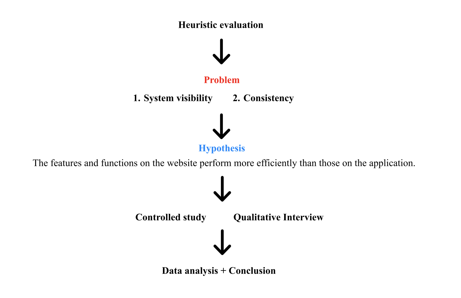
Heuristic Evaluation
The procedure of our experiment started with a heuristic evaluation, which we conducted individually. I scored both the website and the app including justifications on my scoring, and compiled my findings on excel. Our team then came together and combined our findings into one spreadsheet.
Master Heuristic Evaluation Scoresheet:
Hypothesis
We then formed a hypothesis combining our insight from the heuristic evaluation and a focus question provided to us by our client:

Controlled Study
Using this hypothesis we conducted a controlled study which aimed to compare two interfaces and provide us with deeper insight, quantitative data and answer our research questions.
Participants:
The study enlisted primarily golfers with experience at Westwood Country Club, aligning closely with the company’s user base. We had six participants that each signed a consent form and prequestionnaire to safeguard user security. I designed the pre-questionnaire. The pre-questionnaire sought insights into their frequency of visits to Westwood as well their overall user experience. Subsequently, participants navigated through tasks that the team assigned that are representative of typical user interactions and conducted a qualitative interview after.
Procedure:
We assigned a total of six tasks, with participants completing three tasks on the app and the same three tasks again on the website. We measured the amount of time (in seconds) that participants took to finish the tasks, and we also recorded instances where the tasks could not be completed by the participants.
I personally observed and recorded three of the participants and designed the tasks based on our research goals and pain points from the client.
To control for the learning effect, I had the plan to conduct a two-tailed, non-directional study. Half of the participants will perform the tasks on the website first, while the other half will do the tasks on the mobile phone first. This study was observed in-person in an environment that the user is comfortable with.
Task Summary:
Tasks completed in the mobile and desktop interfaces:
Make an order from Fairways Grill & Patio and scheduled a time at 7:15pm
Make a reservation of a golf event for 3 players at Dec 21th
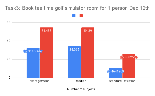
Book tee time golf simulator room for 1 person Dec 12th
Tasks completed in the mobile app only:
Users will sign up for an account to get access to the app
Access your personal account of the Profile page and change your email
Search the newest notification for monthly event
Change your home club to Westwood Plateau golf and Country Club
Results:


Comparing the tasks PVALUE:
The pvalue for the first task was 0.09, which means the null hypothesis cannot be rejected. We believe that this task is the most consistent with the website, because making an order on the app simply brings you to a mobile version of the website; however, we included this task because it was one of the few features that was shared between the website and the app.
The p-value for the second task was 0.23, which means the null hypothesis cannot be rejected. For this task, the average time to book on the website was actually higher than the average time for the app. We believe this is because of the amount of clutter that is on the website in comparison to the app.
The p-value for the third task was 0.04, which means the null hypothesis is rejected. There is a significant difference in the time taken to complete the task.
We believe that due to a lack of visibility in the app, participants had troubles locating the task in the app, which they had later affirmed in the qualitative interviews.
Qualitative Interviews
After our controlled experiment we individually interviewed our participants in a qualitative interview. The goal of this interview was to receive qualitative data describing their overall impression of the interfaces. I interviewed three participants after completing their controlled studies.
Methods:
During our interview, we asked insightful questions to dig deeper and find issues that we may have missed in our heuristic evaluation. We recorded the user’s feedback, and compared their comments to find any commonalities. In summary, the qualitative data we received and analysed was their contentment and satisfaction with using the interfaces.
We did a pre-questionnaire asking about the general demography of the participants, such as age, whether they know about our client company, and the most important things of a golf resort to get a general understanding of the participants. Instead of doing a post-questionnaire, our team chose to conduct an interview which allow evaluators to ask further questions about the participants’ answers which help to mitigate bias and deeper understanding.
Main Constructs to Analyze in Interviews:
Satisfaction:
Satisfaction, which delves into the emotional and affective states of users as they engage in various tasks. To gather comprehensive data on satisfaction levels, participants were prompted to think aloud during the controlled experimental process. This real-time feedback, coupled with note-taking and selective audio recording to capture crucial points, facilitated a nuanced understanding of participants' emotional responses during their interactions with the application and website.
User Preferences:
User Preferences, was utilized to understand participants' inclinations towards specific functions and interface designs on both the app and the website. To collect qualitative data for this construct, we conducted interviews with participants. During this phase, we asked participants to express their views on various aspects of the platforms, recording audio and taking notes for in-depth analysis after the interviews. This qualitative data collection allowed us to gain insights into the preferences of users, providing valuable information for shaping recommendations and improvements in the subsequent phases of our evaluation.
Qualitative Interview Findings
In our qualitative interviews, participants provided nuanced feedback, offering qualitative insights into user experiences. Common responses included:
Coded comments to find commonalities in the data:
“Website is more intuitive, website has more info/actions.”
“Sign up experience was fine for most, with standard booking.”
“The Tee-time is hard to find perhaps there can be more visibility on the app, labels.”
“Website Navigation is a bit chaotic and text heavy.
“What is Platoga?”
Findings:
Positive Perception of Website:
Participants consistently found the website more intuitive, standard, and straightforward compared to the app. This favourable sentiment underscores the positive user experience with the website.
Challenges Navigating the App:
Some participants found it challenging to navigate to the booking function on the app, specifically noting an unlabelled plus sign icon at the bottom of the screen. Participants suggested labeling this icon for clarity.
Chaotic Website Navigation:
Interviews revealed a consensus on the chaotic and text-heavy nature of the website's navigation. This aligns with heuristic evaluation findings (where evaluators found the website cluttering , spreadsheet in appendix 1), indicating a consistent pattern of user perception and emphasizing the need for addressing clutter and disorganization.
Overall Significance:
The inclusion of Task 3 (booking a Tee Time for the Golf Simulator Room on Dec 12th for 1 Person) further emphasizes the significance of the significant difference in completion time between the website and app. This specific task highlights a crucial area for improvement to ensure a seamless and efficient user experience, as supported by both quantitative and qualitative data.
Summary Key Findings:
Quantitative: Only the golf simulator booking showed a statistically significant difference in completion times (p=0.04), with the app being more difficult
Qualitative: Users found the website more intuitive overall, but cluttered. The app had a confusing unlabeled "plus" icon for booking
Conclusions and Redesign Recomendations
Issues and Solutions Summary:
App:
Issue: Poor visibility of golf simulator booking; unclear "plus" icon.
Solution: Improve simulator booking visibility (place it with other golf bookings); label the "plus" icon.
Website:
Issue: Cluttered interface, redundant "tee-time" button.
Solution: Streamline the interface; remove or improve the "tee-time" button (fewer clicks to booking).
Both:
Issue: Lack of consistent features across platforms.
Solution: Add features like user profiles to both.
The proposed design changes aim to improve navigation, address user confusion, and create a more consistent and user-friendly experience across both platforms.
Usability challenge with Task 3's tee time booking on the app. Participants struggled to locate the feature, indicating a visibility issue. To resolve this, we propose adding golf simulator and practice hole booking options directly below the club location section, mirroring the website's layout.

The "big plus button" lacked clarity, prompting a redesign of the navigation bar and homepage. The homepage now features a calendar shortcut for reservations, addressing the app's primary function. The revised navigation bar consolidates the menu, freeing up homepage space, and offers a dedicated reservation section with expanded functionality.

Website clutter and overlapping functions were also noted. To address this, we suggest aesthetic improvements, including streamlined categories (dining, golfing, events) and a dropdown menu for additional functions, enhancing overall organization.
The website's tee-time shortcut was deemed redundant, requiring the same number of clicks as the standard navigation. We recommend either removing it to reduce clutter or making it a direct link to the bookings section within golfing.
To enhance consistency, we proposed integrating missing functions across platforms. This includes adding a profile feature to the website, mirroring the app's functionality. Conversely, the app will incorporate a link to website-exclusive features like event bookings and information access, ensuring users have complete functionality regardless of platform.

User Testing and Research
User research for a client using heuristics, a controlled study and qualitative interviews and surveys. Suggesting actionable design updates to address painpoints identified.
Contribution:
User research, project management, usability tests, documentation, distribution, stakeholder communication